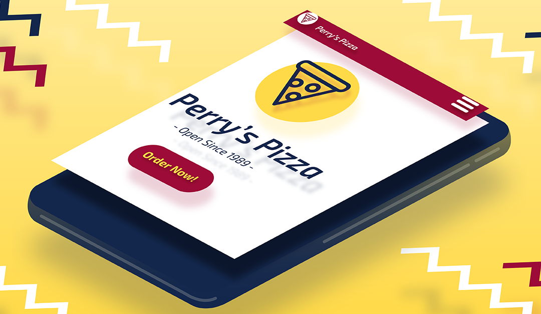
Have you ever visited a website on your phone, only to realize you can’t see half of the screen?
It’s a frustrating experience. You want to view the website, but you have to zoom in and scroll over just to read a full sentence.
This is what happens when a website is not mobile-friendly. Lack of mobile optimization costs businesses money. In fact, one source reports that 57% of users say they won’t recommend a business with a poorly designed mobile site. Ouch! How can you avoid losing business?
Why Your Small Business Website Should Be Mobile-Friendly
In addition to meeting the needs of your users, mobile-optimization plays a role in Google ranking. When a user performs a Google Search, they are directed toward high quality sources optimized for the device they are searching on.
You can use Google’s Mobile-Friendly Test to assess how easily a visitor can use your page on a mobile device. If it’s not mobile-friendly, here are five changes to make.
5 Ways to Make Your Small Business Website Mobile-Friendly
1. Use a responsive design. Whether you build your own site or outsource to a developer, your website should be responsive. A responsive design ensures that your website is easy to view on different devices—from a computer to a tablet to a phone.
2. Focus on font and button size. Avoid forcing your users to squint or zoom in to read your site. Your font should be at least 14px. When it comes to buttons, the bigger the better. Make your site legible and enjoyable to use.
3. Eliminate pop-ups. While you want to generate leads, a single pop-up can overtake an entire screen. If your mobile site is overloaded with pop-ups, your users will quickly become frustrated and leave. This high bounce rate will decrease your ranking and sales.
4. Break up long paragraph. A lengthy paragraph on a desktop looks normal. A lengthy paragraph on a phone looks like a dense novel. Use this article as a model. No paragraph includes more than five sentences.
5. Consider your images. A complex or text-based image may be legible on a desktop, but hard to read on a phone. Choose simple images and double-check that your website can automatically resize your images based on screen size.
The Bottom Line
Your website needs to be mobile-friendly. Make sure it meets the needs of your mobile-users: use a responsive design, choose an appropriate font size, eliminate pop-ups, minimize text, and optimize images. Your visitors—and bottom line—will thank you.
—
Electronic Merchant Systems is a leading provider of payment processing & merchant services. For more information please visit our website.

